


Hi! I’m Gioia — a designer who thrives on synthesizing ideas across disciplines. With a passion for graphic design, urban thinking, and firecracker energy, I bring creativity, an analytical mindset, and intentional craft to every project.
Get in touch with me.


Working big ideas and fine details, I love connecting dots across design, planning, and strategy to turn complex challenges into clear, compelling solutions


-
![]()
Hill City Crash Rebrand
The rebrand of Hill City Crash highlights the deep commitment to their mission, grounded in faith and integrity. Every design choice was intentional—crafted to reflect professionalism, pride, and the relentless spirit of our team and city.
-
![]()
Quantum Heist Branding
The branding for Quantum Heist blends in-depth research with a strong understanding of industry trends, all while carving out a unique identity for the game. We focused on creating a narrative-driven experience that stands apart, ensuring the visuals and messaging capture the game's core themes while staying fresh and distinctive in a crowded market.
-
![]()
Malled to Death
The graphic design for Malled to Death reflects a deep understanding of urban planning and the evolving history of the mall, blending meticulous research with a sharp sense of place. Our approach to environmental design ensures the exhibition not only educates but immerses visitors, bringing the story of malls to life through thoughtful visuals that engage and provoke reflection.
-
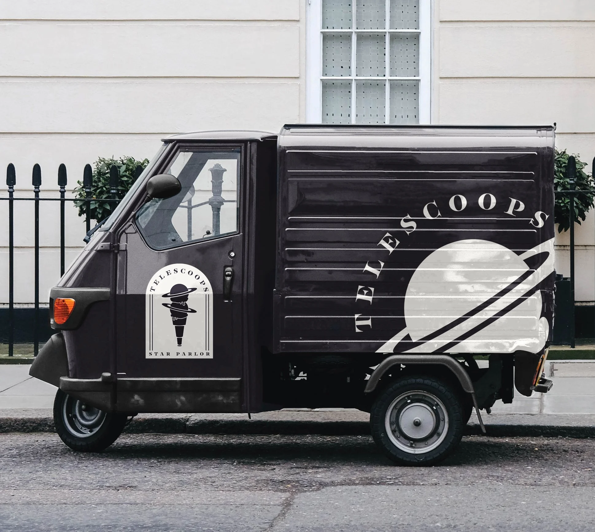
![]()
TELESCOOPS
The branding for TELESCOOPS breaks away from traditional ice cream, offering a unique experience that goes beyond just the taste. With a fresh, distinctive approach, this identity captures the magic of star-gazing while delivering an unforgettable experience in both product and presentation.